Basic Color Theory
The success of a watercolor painting is based in basic color theory. Color theory explores the visual effect that various paint colors have on one another,
either in the context of blending them to make new colors, or in understanding
the science of how we see color.
Color theory organizes color into groups or categories:
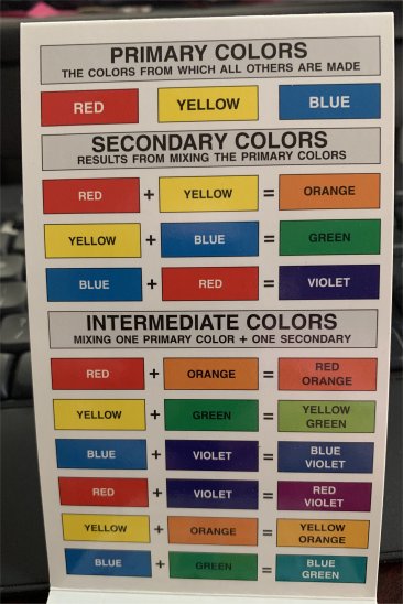
- Primary colors: the primary colors are red, blue and yellow. They are primary because they cannot be made from any other color, and because they are used to create all other colors.
- Secondary colors: secondary colors are a mixture of two of the primary colors. For instance, if you mix blue and yellow, you get green; red + yellow = orange, and blue + red = purple.
- Tertiary or intermediate colors: these colors
are mixtures of a primary and a secondary color, such as yellow-green,
blue-green, red-purple, blue-purple, etc.
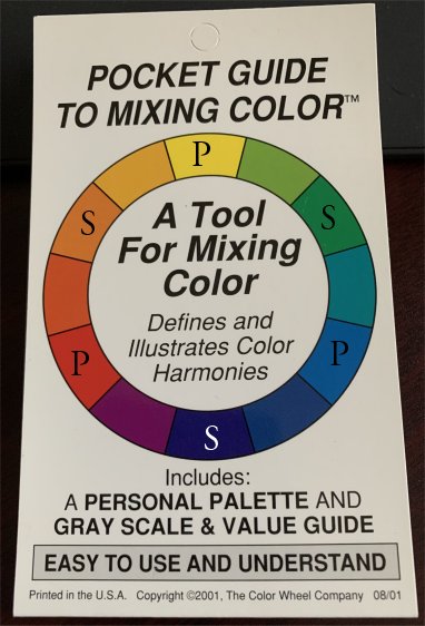
You may have seen a glossy color wheel or poster in the art store.
Here’s a pocket color guide I had laying around. This one folds up like an
accordion. I marked the primary and
secondary wheel colors on the cover. The second page shows the color combinations. This is a handy visual tool
to have around when you are mixing colors.
 |
 |
Basic Color Theory: Warm, Cool and Neutral colors
Another aspect of basic color theory has to do with the relative
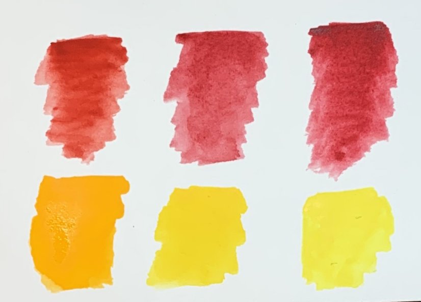
visual “temperature” of a color. Red, orange and yellow are considered warm
colors, especially when compared to blue and green. But there are also warm and cool shades
within a color. Here’s an example of how
red or yellow can be warm or cool. Note the Gamboge yellow and the Cadmium Red on the left look warmer than the cool Alizarin Crimson and Lemon yellow on the right.
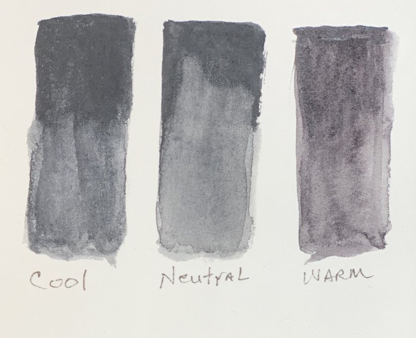
Neutral Grays
Neutral shades are those that are equal on the cool/warm scale. You can see this “neutral” concept better with gray colors. Below are three different gray paints. The cool shade on the left is a mixture of Winsor and Newton’s Neutral Tint and ultramarine
blue. The middle shade is just the Neutral
Tint by itself, and the warm shade on the
right is Joseph Z’s warm gray made by Daniel Smith. Note the cooler shade on the left shows the
blue tones while the warmer shade on the right has reddish tones. The middle shade is neither more blue or red
toned, hence the neutral designation.
Here's another example of the wide variety of grays that can be created.

Why is an awareness of the coolness, warmth or neutrality of a color important in watercolor painting, you may ask?
Well, a cooler shade can be used to give the
illusion of distance in a landscape. Google “watercolor landscape paintings”
and check out the colors; notice how mountains or trees have a bluish color
when they are far off? Warmer shades can
give a visual indication that things are nearer to the eye. Also, you can use grays to complement other colors. For instance, an orangish gray sky might set off the bright blue of a boat. I discuss complements below.
Complement Colors
Color complements are opposite each other on a color wheel. For instance, red is opposite green, violet is opposite yellow, and blue is opposite orange.
Another way to think about color mixing with complements is Jeanne Dobie’s method. In her book Making Color Sing, she writes “..the complement of a primary color is simply the remaining two primaries mixed.”
Remember that the primary colors are red, blue and yellow. So if you mix blue + yellow = green. The remaining primary then is red, and that makes green the complement color of red. So what? Well, when you are mixing paint, you’ll discover that if you mix two complement colors, it dulls both and makes a gray color. Using this knowledge, you can mix MANY, many different shades of duller colors, and those colors can be used to make the vibrant colors in a painting really shine.
In addition, using complement colors separately in a painting can make for a beautiful contrast. Search Google for a 1913 painting done by John Singer Sargent called Fisherwoman. He used a blue and orange (red + yellow) complement to create that painting.
My color mixing page has more information about how and why these factors affect your paint mixing results. You can also check out my color mixing chart for specific paint colors on these spectrums.
Analogous Colors
Another basic color theory principle is the one of analogous or similar colors. These are colors which are next to
each other on a color wheel, and they can be easily blended to make many new
vibrant colors. For instance you can blend blue, blue-green, and green into many beautiful and individual colors. Claude Monet's Woman with a Parasol, Madame Monet and Her Son (1875) is one famous painting that uses an analogous palette.
Triadic colors
Triadic colors are those colors on a color wheel that are at
45-degree angles from each other. If you were to draw lines from each to each,
it would create a triangle relationship on the wheel. If you Google “abstract paintings” you can note how many of them use this basic color theory principle. Many abstract paintings will have a red-blue-yellow theme, or an
orange-violet-green theme, and one of the colors will dominate, while the other
colors will act as secondary players. It
makes for a very interesting visual. The image below uses violet, orange and touches of green as the main color mixing scheme.
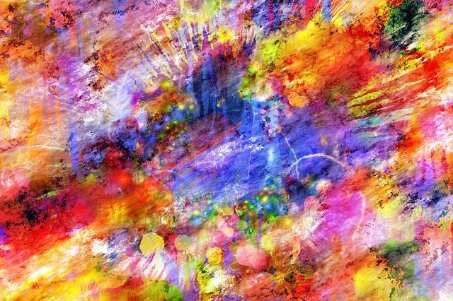 Image by Gerd Altmann on Pixabay
There are other basic color theory combinations to explore, such as split
complementary and tetrad relationships. Learning basic color theory is interesting and can help you increase your painting successes.
