Watercolor Paint
Wondering how to choose a brand of watercolor paint? I sure found it confusing at first. There are so many different brands, and I didn’t know whether to buy it in tubes, in pans (solid cakes of paint in either stick format or in plastic containers) and in liquid form. I also had trouble choosing colors.
I’ve since learned buying paint is dependent on your
artistic goals. What do you want to
paint? What will you do with the painting?
Are you wanting to take commissions and get paid, or is painting just a
hobby? Depending on your answers, your
purchases could vary greatly.
Watercolor Paint Brands
If watercolor painting is a hobby and you don’t plan to sell your work, you can start with student-grade paints (versus the more expensive artist-grade). Brand names such as Grumbacher Academy, Master's Touch, Artist’s Loft and the Winsor and Newton Cotman line are student-grade. You can find these on Amazon, or at Michael's and Hobby Lobby stores in the USA.
If you want to sell your work, I'd encourage you to buy professional, artist-grade paints. These paints are rich with pigment and result in brilliant colors and better performance on watercolor paper. The color vibrancy will also stand the test of time better than cheaper paints.
Professional artist-grade paint can be purchased from various art supply stores and warehouses such as Jerry's Artarama, Dick Blick or Cheap Joe’s. Brands include Daniel Smith Extra Fine, Winsor & Newton’s Professional line, Sennelier Aquarelle, Holbein, and the more expensive Schmincke brand of watercolor paint.
Since I know you are now wondering what I use, I'll tell you that personally, I am in the process of changing my entire paint collection out so that I only use Daniel Smith paint colors. I wish I had known they were the ones to buy when I first started out. (You're welcome.)
Choosing Paint Colors
Choosing paint by color is a task that many beginning artists find difficult. There are so many choices, it's hard to figure out what to buy. The Daniel Smith Extra Fine line alone offers more than 180 different colors!
However, you only need a few colors to get started. In fact, you could start with just three primary colors: red, blue and yellow, because it is possible to mix many different colors from combinations of these three basic hues. I say possible, as you would need to learn about color theory, paint ratios, color mixing (or why a warm versus a cool shade is important), transparency and opacity, staining power and other nuances of mixing paint colors to do it, but it could be done.
You could also make choices depending on what you plan to paint. In my case, I like to paint animals. I've found that the following colors are useful:
- Yellow
Ochre
- Burnt Sienna
- Ultramarine Blue
- Hansa Yellow Medium
- Lemon Yellow
- Permanent Rose
- Transparent Brown Oxide
- Quinacridone Gold
- Warm neutral gray and a cool neutral
gray
As I continue to learn about paint, I'm sure some I will replace some of these colors with better options, so don't hold me to them.
If
you plan to focus on painting flowers and landscapes, check out artist Jane
Blundell’s ultimate mixing palette. She creates some amazing art with her paint color choices.
Or you could just choose the colors you like, and go with a distinctive palette of choices that suits your individual
style and goals.
Color Differences Between Brands
Something else to keep in mind when choosing paint is that colors with the same name can look very different, depending on the brand. Below is a picture of a “Burnt Sienna” color comparison.
As you can see, straight out of the tube and on the paper, the professional Winsor & Newton brand looks different in comparison to the Daniel Smith brand, while the Artist's Loft student paint mimics the Daniel Smith. But I had pick up more of that Artist’s Loft paint on my brush to get the same color coverage on the paper as the other professional paints.
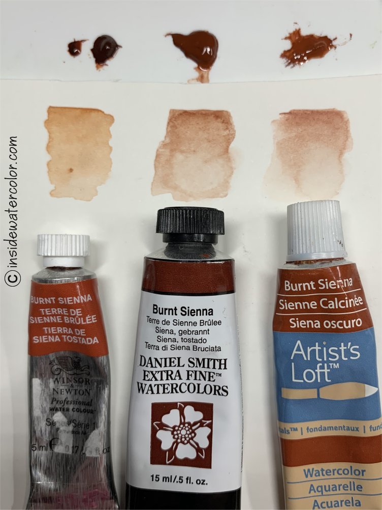 Color differences between brands of paint
A Quick Note for Animal Artists
For those of you who like to paint animals, here's something to consider. Before you begin a painting, look at the paint manufacturer's color charts and figure out if the paint colors you are planning to use are transparent or semi-transparent. If you plan to lay washes over detailed underpaintings (fur or feather markings), use semi-transparent paints for those first few layers. Otherwise, subsequent wash layers will disturb or muddy the details you laid in first. Be aware that in one brand, Burnt Sienna might be semi-transparent, but another brand might rate the same color transparent, so it pays to look at those charts. Here are the links to some manufacturer's charts:
- Daniel Smith color chart
- Holbein color chart
- Schmincke Horadam color chart
- Winsor Newton color chart
White Paint versus White Paper
BIn watercolor painting, the paper is the white “paint”. In other words, the idea is to leave more of the white paper to show through in areas of the painting that are lighter. Hence, in watercolor, you don't use white paint to lighten like you do with acrylic or oil. Instead, you start with leaving the lightest areas of the painting without paint, and applying light washes of paint to create colorful areas. You then allow the painting to dry between applications of color. Taking care not the disturb the underlying areas of paint, additional layers of color are then gently applied to darken the areas of shadow or to achieve deeper hues.
That is not to say you never use white in watercolor painting. Many watercolor
artists, including me, rely on a tube of water-based white designer’s gouache or a jar of
Dr. Ph Martin’s Non-Bleed White for highlighting at the finishing stage of a
painting.
What About Black Paint?
There are many different shades of dark gray and black available in watercolor paint. I started out buying "lamp black" paint, but quickly realized it looked weird on the paper. It was “muddy” and made the final painting look dull. I did some reading and figured out that the dark colors in a painting should be mixed from semi-transparent colors, and that using a straight black paint is not best practice in achieving darker hues.
The better idea is to "mix" your darks using colors which are transparent or semi-transparent. If you mix two contrasting or complement colors, such as a red paint and a green paint, you get a dark gray which allows light through. Depending on the red and green hues chosen, a whole bunch of different gray hues can be mixed up. Lamp black is an opaque paint, meaning it blocks all light and that's why it looked dull.
Over
time, and through practice, you can experiment and create your own grays and blacks from a variety of basic complementary hues.
Transparency: the Mud Factor
The gray/black issue arises from an important characteristic of watercolor paint that I mentioned above. It's a factor called "transparency". Depending on the pigment in the paint, it can be rated transparent, semi-transparent or opaque.
The transparency or "luminosity" factor is a measure of how much of the white watercolor paper a paint color allows to show through to the viewer's eye. As I mentioned above, when I first started out, the black areas of my paintings looked dull. I finally figured out that it was because I was using that opaque lamp black. Opaque paints don’t let any white paper show through, and the result on the paper looks and acts like mud. This isn't necessarily bad if you want that effect, but generally, watercolor paintings shine beautifully because of the transparent and semi-transparent colors.
Instead, as mentioned, artists use a mixture of two semi-transparent colors such as ultramarine blue and burnt sienna to make a darker, rich brown color. Applied in thin layers, this mixed dark color is still somewhat transparent, and it looks better on the paper. Rebecca Rhodes, one of my favorite animal artists uses this color combination for many of her paintings.
I’ve also discovered that there are some beautiful, semi-transparent neutral gray options such as Daniel Smith’s brand of “Joseph Z’s Greys”. The Daniel Smith company created these colors specifically for Joseph Zbukvic, one of Australia’s top watercolor artists.
Often, I will use these grays right from the tube, and they allow me to paint my dark areas more easily while preserving the transparency. Mostly, I like that I’m not having to continually mix up a new batch of dark paint. But I’m lazy like that. Many other artists prefer to mix their dark colors, and as I learn more, I'll probably end up doing the same.
As mentioned above, both Daniel Smith and Winsor & Newton offer charts of their paint colors that include indications of transparency, and they also include information on staining power and for some colors, lightfastness. Lightfastness
is a marker of whether the paint will fade if exposed to light over time.
Tubes, Pans or Liquid?
Now that you have an idea of what colors to buy, the next choice you'll face will be whether you want those colors in tube, pan or liquid form.
I started out buying tubes of watercolor paint, mostly because I was used to buying acrylic paint in tubes. I’ve since learned that pan-based paints are just as useful and brilliant. The pan paints are also offered in sticks, much like pastel artist sticks.
Liquid paint comes in jars with eyedropper tops, so that you can just drop the paint in to your palette. These paints tend to be dyes, not pigment-based paints, so they will behave differently, and they are not lightfast under normal light conditions. Most professional artists choose pigment-based tube or pan paint forms.
Paint tubes come in several different sizes, depending on the brand. In the United States, the small 5 ml and medium 15 ml sizes are common in the hobby stores, but you can order large 37 ml tubes too. Some other brands such as Sennelier offer 10 ml, 20 ml and various other size tubes.
Make a Pan Palette from Tube Paints
I also figured out that you can squeeze small amounts of your tube paints into the wells of a plastic palette and just let them dry there. Then you don’t have to go searching for a tube when you want to paint. Seems obvious, but it didn’t occur to me to do this until months after I started painting in watercolor. Sometimes my brain works, sometimes not.
Upon having that thought, I made myself a few palettes of my
favorite colors and used a sheet of cheap watercolor paper to chart the color names so I wouldn't forget what was where. My chart is old now, and some of the color places have changed, but you get the idea.
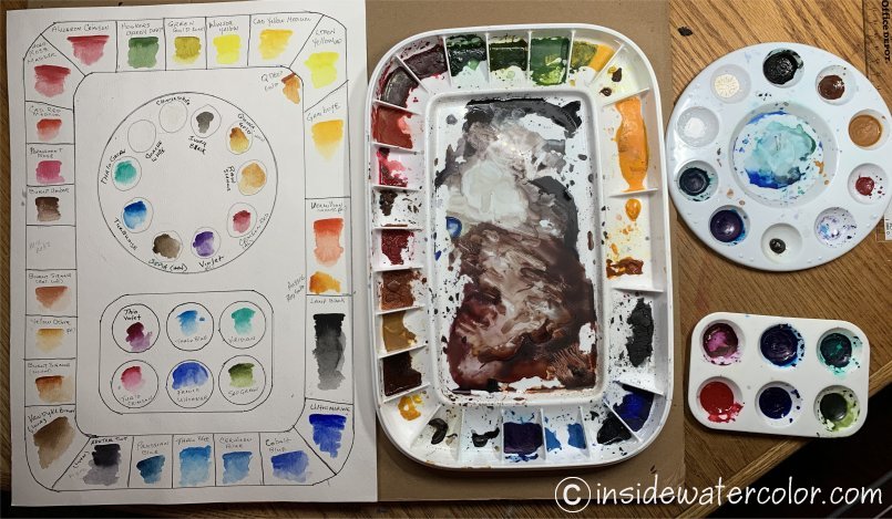 Made my own pan palette and reference chart from tube paints
You can also create your own color charts. Artist Jane Blundell has a great blog on mixing watercolor paint, where she tests various color combinations on paper and then publishes the resulting charts.
The only issue I have with making up a palette this way is that over time, I've let the color chart and colors on the palette get out of sync. Then I'm not sure what color I'm using at times, which can be annoying, but not worth wasting the paint by cleaning the palette.
A Note about Paint Toxins
Finally, be aware that some of the ingredients in watercolor
paint can be toxic if they get on your skin.
Manufacturers are required to post warning labels on their paints if
they contain toxic ingredients. You can learn more about this on their websites by searching for Safety and Health Data Sheets.
