Mixing Colors: Color Wheel Comparisons
Mixing colors correctly depends on understanding the factors that differentiate one paint from another. We start by learning basic color theory and then progress to understanding how a watercolor paint's "temperature" (whether it's cool or warm) comes into play when it is mixed with other colors.
I discussed the basic idea of how the temperature of a primary color can be used to make vibrant or dull colors in detail on the Color Mixing 101 page. Here, we will go a step further and I'll show you how to make yourself some color wheels to help you understand the physical results of mixing colors by temperature.
Mixing Colors: Creating Color Wheels
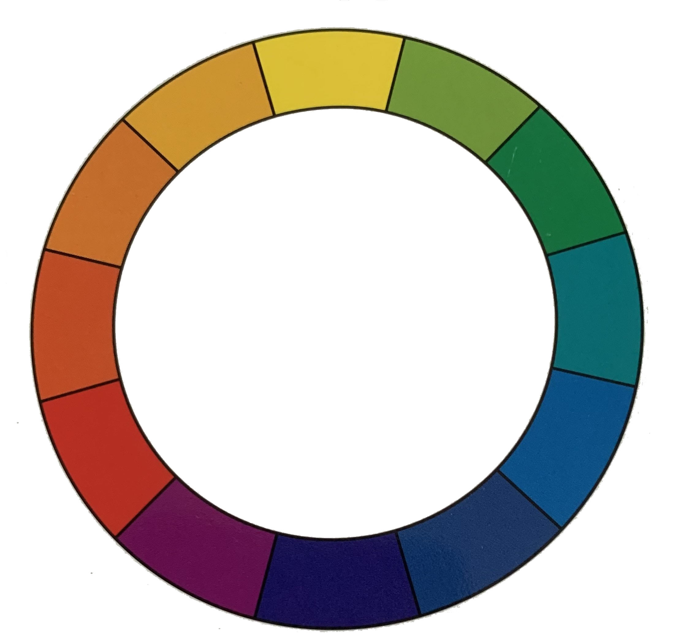
This is a basic color theory wheel which you can find in any art supply store. Nice to have, but I'm going to show you how this basic wheel is not all that helpful when you want to mix a vibrant purple for a flower painting. Yes, it shows you (according to color theory) that if you mix red and blue, you will get some hue of purple.
What the basic wheel doesn't tell you is that you must take into account the relative warmth or coolness of the hues chosen and the associated complement color if you want to create that vibrant purple successfully.
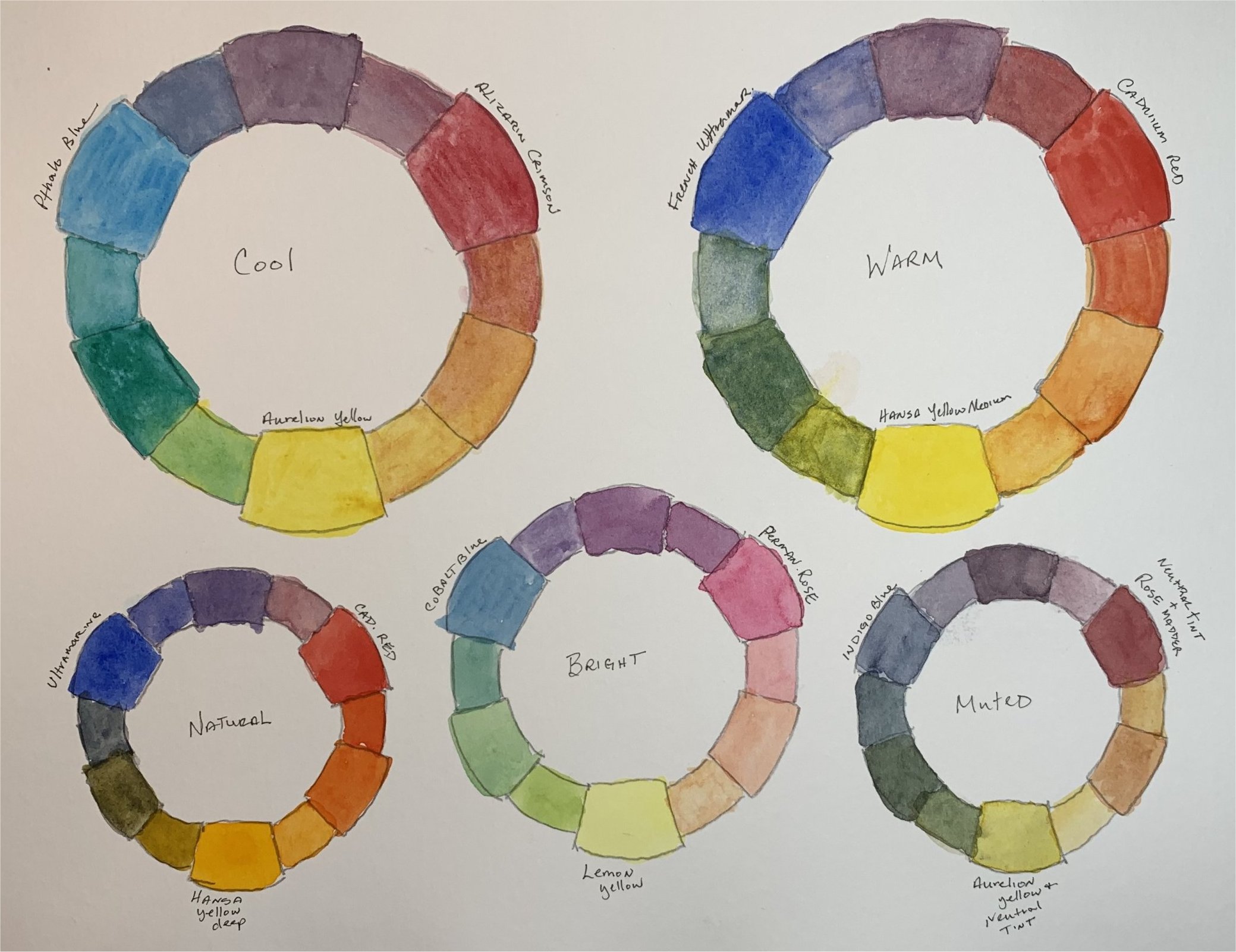
For instance, I made the color wheel page at right for myself. With just a glance now, I can quickly see the different colors I can create by choosing paints which are either warm or cool hues, or muted, natural hues or bright, transparent hues.
Study the wheels I made and you'll see that each wheel has a red, blue and yellow hue that are then mixed in various amounts to make the other colors.
But each wheel looks very different from the others. This is because the red, blue and yellow primary mixing colors I chose were either warmer or cooler, more muted or bright, or have a gray or other neutralizing tint added that made them different from the other paints.
You can make yourself these kinds of reference wheels too. Here's how:
- Download this color wheel file. It has the various sized wheels on one page like mine above. (or here's one single large one).
- Once you've downloaded and printed the page, use graphite paper to trace them onto your watercolor paper. (Or you can just hand draw a similar wheel on your watercolor paper.)
- Pick out a red, blue and yellow color from your paint box. These are the primary colors and they will go in the largest three boxes on the wheel.
- Dab each onto a large clean area of your palette, leaving space around the dabs for mixing in water.
- Using clean water, make a puddle of each color and then paint them onto the paper in the correct places. Now here's the tougher part of creating the secondary colors.
- Mix red and blue to make a purple. You'll have to eyeball this, mixing different amounts of either red or blue to get to the middle shade of purple. Some reds or blues are stronger than others, so you'll have to play with them. Is the shade too blue? Add a little red. Can you still see some red? Add a little blue. This is where your artist's eye will come into play. Once you have the right color, paint it onto the wheel in the larger box between red and blue.
- Mix blue and yellow to make a green shade. Again some colors are stronger than others so you'll have to determine when you get to a middle green color. Once you have a middle green, paint it into the larger box between blue and yellow.
- Using the method described above, mix red and yellow to make an orange, and then paint it into the larger box between red and yellow.
- Now you can go ahead and paint in the tertiary colors by mixing the secondary purple, green and orange colors with a little more of the primary colors are either side to create a red purple, a blue purple, a yellow green, etc.
- Once you've finished the first wheel, choose a different red, blue and yellow to create the next wheel.
- Experiment with adding different grays to colors to get muted shades too.
Cool, Warm, and Granularity Factors
Below are two more wheels I made with some new colors I bought.
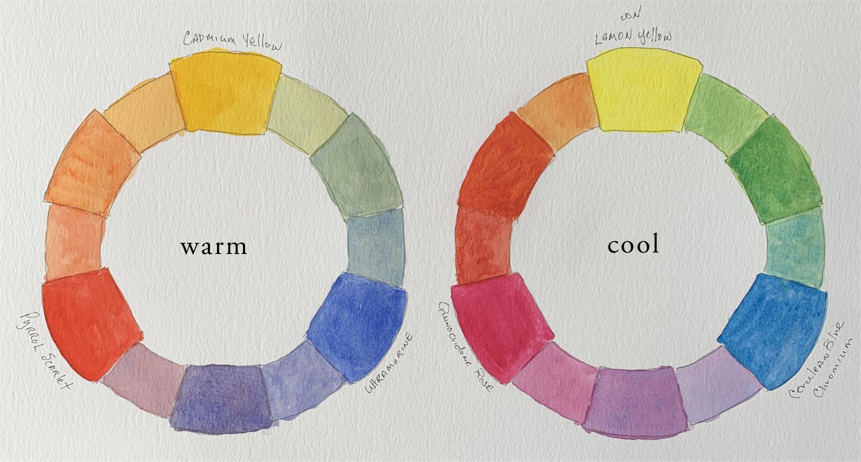
The new Pyrrol Scarlet red shade is so warm that it is almost orange and as you can see, it made for a more yellowish orange. The new Cerulean Blue Chrome I bought didn't want to mix well with that Quinacridone Rose. I had to keep mixing them on the palette, and it wanted to separate on the paper too. It was kind of a neat effect if you want that, but I'll keep it in mind the next time I'm mixing colors and aiming for a smooth effect on the paper.
This mixing issue has to do with the particle sizes or granularity of the two paints. Blue colors tend to have larger, clumping particles while red paint colors tend to have smaller particles or granules. So another thing to remember about mixing colors: combining watercolor paints with different granulation rates is a challenge. Most of the paint manufacturers have this granulation information on their color charts. Here are three that I can share:
- Daniel Smith color chart
- Winsor Newton color chart
- Schmincke Horadam color chart
I hope you found this color wheel exercise fun and informative. I think creating these wheels helps you save paint and time, because you don't have to mix and remix paint on your pallet trying to find the right color combination for what you want to achieve.
If you have questions, send me a message from my contact page.
