Color Mixing from Color Theory
The art of color mixing is dependent upon a knowledge of basic color theory principles. I talk about primary and tertiary colors, color complements and color temperature on the basic color theory page, but there is more to discuss and discover about color theory which will help you mix color with greater success. So let’s go over the important points about color theory now. I'll lay down some of the basics again, and then add some new ideas further on:
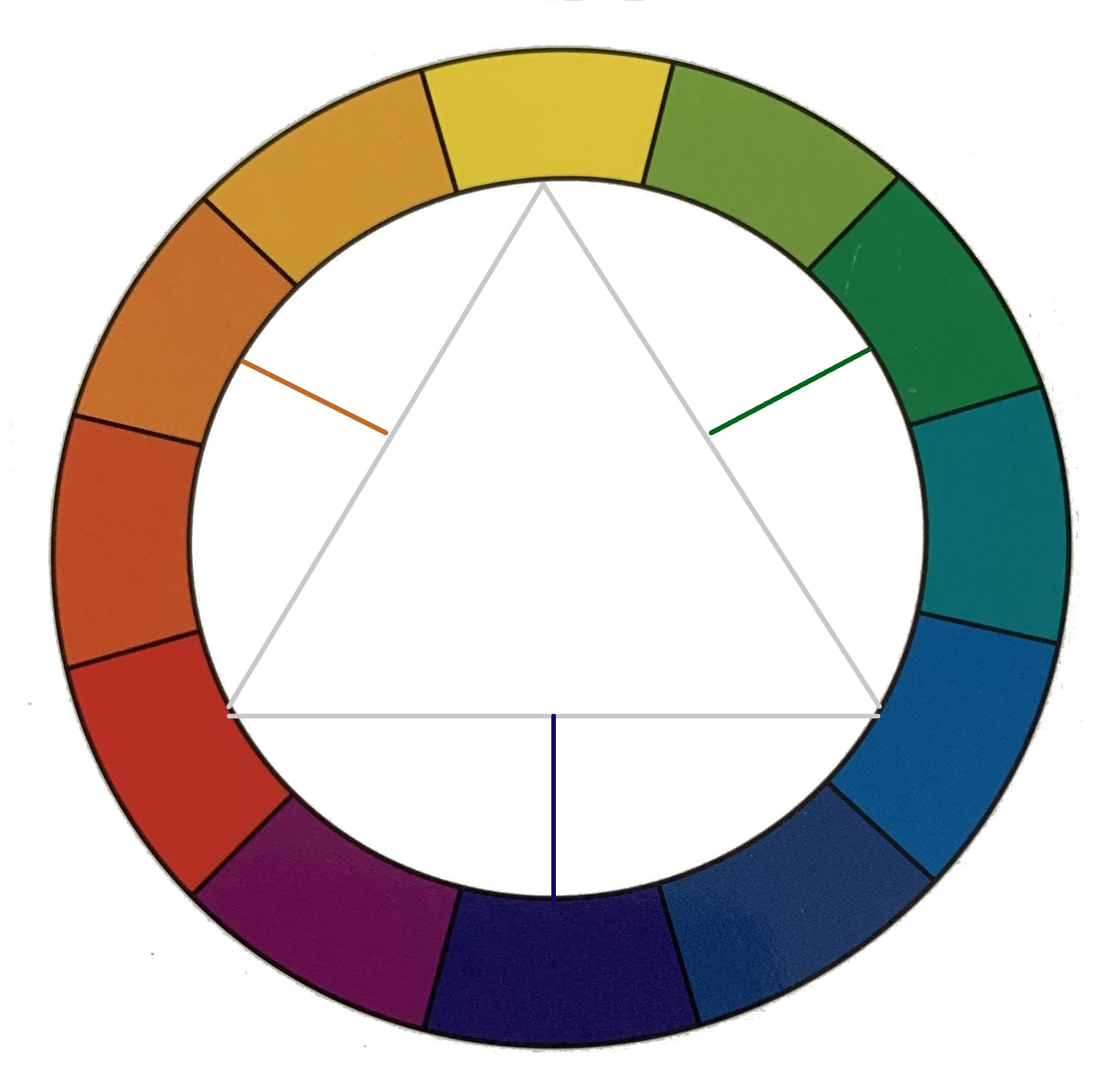
- Basic color theory states that there are three primary colors which cannot be made from any other colors.
- These primary colors are red, blue, and yellow. The triangle in the picture above connects the primary colors. All other colors are made by mixing the primary colors in various combinations.
- Secondary colors can be made from combining two of the primary colors as follows: red + blue= violet (purple); blue + yellow = green; red + yellow = orange. The secondary colors are marked with radiating lines from the primary triangle in the picture above.
- The combination of any two primary colors will create a secondary color that “cancels” the remaining primary color. For instance, mixing red and yellow makes orange. If orange and blue (the remaining primary) are mixed, a dull, gray color will be the result. In this scenario, orange and blue are “complement” to one another. Note that complement colors are directly across from one another on the color circle.
- In general, red and yellow are warm colors, while blue is a cool color.
- Within each primary color range, there are various shades which
can be either cool (lean toward blue) or warm (lean toward yellow or red). For
instance, Cadmium Red is more red or warm, and Alizarin Crimson is more blue or
cool, but both paint colors are in the red range.
Color Mixing 101
So, in order to mix colors correctly, one must pay attention to:
- the primary colors being mixed,
- the resulting mixed color's complement color and
- whether the primary colors being mixed are cool or warm.
Here are some examples of how these points will affect a resulting mixed color. Let’s start with mixing up a purple (aka violet) color.
Color theory states that in order to create purple, you must mix red and blue. But’s let think about the color result you want. Do you want a vibrant violet for a flower painting? Or do you want a dull purple for a shadow in an urban cityscape?
If you want a vibrant color, you'll want to choose a red and blue that are cooler, since any color with yellow in it will dull the resulting color. (Why? See number 4 in the list above. Yellow cancels out the other two mixed primary colors that make up purple (those being red and blue).
Here’s a visual of this concept:
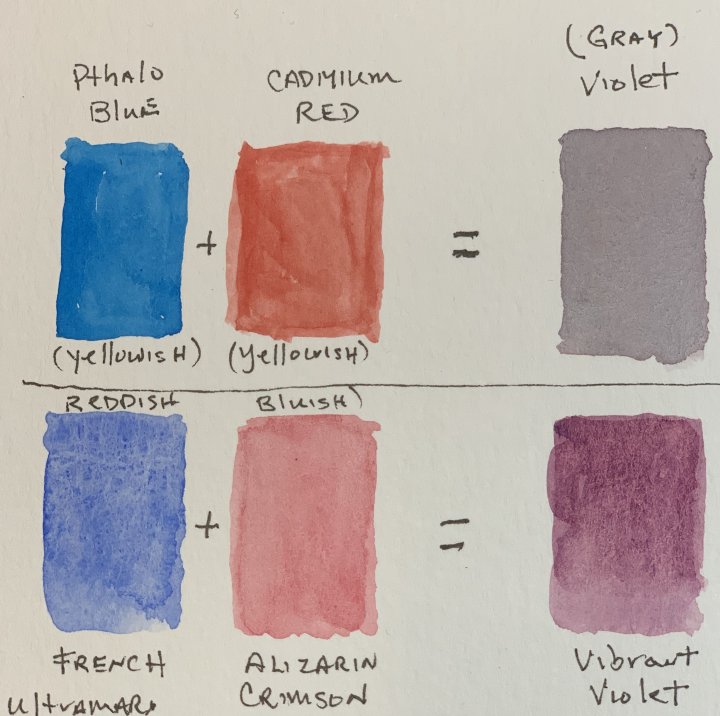
The Phthalo blue and Cadmium red make a dull purple. This is because both colors are warm, meaning they have more yellow in them. Since yellow is the complement of purple, you get a dull result.
But French Ultramarine and Alizarin Crimson make a beautiful, vibrant violet (purple). This is because both colors are cool and lean towards being blue-red, the two colors that must be mixed to make purple.
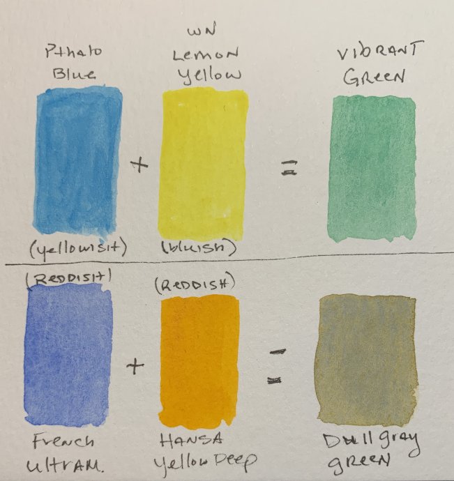
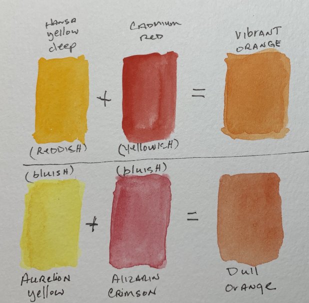
Below are some similar color mixing examples for green and orange.
More Examples
On the green example below, the more vibrant green is possible because the colors chosen are NOT red-toned. They are blue toned, one of the primary colors from which green is made. Because there is no red to dull the green, the mix produces a vibrant result.
The mix of a warmer, reddish French Ultramarine and Hansa Yellow Deep make a very dull green, because red is the complement color of green. This is the kind of green that might be used to paint leaf litter on a forest floor.
In the orange example below, the difference is less noticeable. The warmer Hansa yellow deep and cadmium red made a vibrant orange, while the cooler Aureolin yellow and Alizarin Crimson resulted in a duller, but still nice orange. (I gotta remember how to spell aureolin and phthalo correctly).
Using Complement Grays to “Pop” a Vibrant color
Another way of using complement colors is to place them within a painting to create “settings” for your vibrant colors. For instance, say you are painting a violet flower and you want the color to really glow. One of the best ways to do that is to put that flower in a setting of yellows and yellow grays. Even though the color is vibrant on its own, it will look even brighter next to a complement color, and this is especially true if you look at the painting from a short distance.
Here’s a visual example:
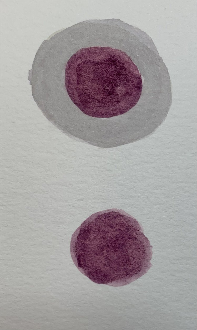 |
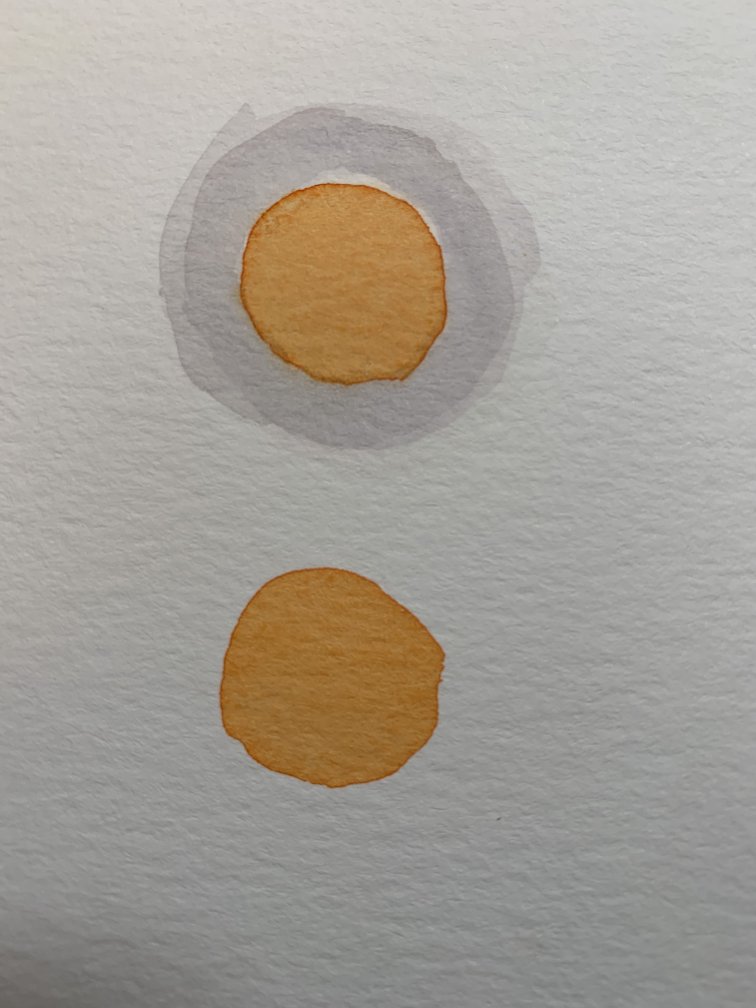 |
Get up and walk away from your computer
a few feet and look at these pictures above. The colors within the gray circles should look brighter than the colors outside of the gray circles. The grays I used are made from the complement color of that secondary color.
Other Factors that Affect Color Mixing
Successful color mixing is also dependent upon taking into account the transparency or opacity of each watercolor paint, and the staining power of the paint.
Now that you have this color mixing information, let's explore the practical aspects working with watercolor paint and physically mixing color on your palette.
Finally, if you found this information fascinating, and want to learn more about the nuances of color mixing, I recommend Jeanne Dobie’s book Making Color Sing and Jane Blundell's blog.
