Transparent Watercolor Tips
Achieving a transparent watercolor finish in a painting is something that all watercolor artists aspire to do. Seeing the white paper shine through a beautiful, luminous color wash is what makes a deftly executed watercolor so magical.
Hence, artists pay a lot of attention to the transparency factor of watercolor paint. This is true not only with vibrant colors, but also with the dark, shadowed areas of a painting. Since it is important, let’s talk about watercolor paint transparency.
It’s a relative concept, in that any watercolor paint can be made transparent just by adding more water. But there are certain paints which offer a greater degree of transparency even when applied in layers.
Watercolor Transparency Ratings
Watercolor paints are given transparency ratings by the paint manufacturers. Most paint manufacturers like Daniel Smith and Winsor Newton offer color charts which include this information. On these charts, each color has its own transparency rating, which can be one of the following designations:
- Transparent: the paint allows a lot of light to be reflected back from the white paper to the eye. This is because it just sits on top of the paper, and doesn't really soak in. The benefit is that colors remain vibrant and luminous. However, the drawback of total transparency is that it is more difficult to build rich dark areas using these colors. It's also easy to disturb the paint once it dries which could be good or bad. Transparent colors include Cobalt Blue, Viridian green, Aureolin yellow, Daniel Smith’s Mayan Yellow, Rose Madder Genuine, Daniel Smith’s French Ultramarine, New Gamboge yellow and Prussian Blue, and most of the Daniel Smith Quinacridone colors.
- Semi-transparent: the amount of light allowed to reflect back to the eye will be related to how much the paint is diluted and layered. These colors tend to soak into the paper fibers more readily. As more layers are added, less light will show through. These colors are useful if you want to use layering to go from light color to a rich dark color in the final painting. There are many semi-transparent colors but the most common might include Burnt Sienna, Ultramarine Blue, Burnt Umber, Pyrrol Orange, Cadmium Yellow medium, Hansa yellow medium and deep, Permanent red, Payne’s Gray and Hooker’s Green.
- Opaque or sedimentary: These colors don’t allow much light through unless very diluted. They tend to soak in and bind to the paper fibers and once on, are very difficult to remove. They are great for achieving very, very dark areas in a painting, but using them for large areas will result in a muddy looking painting. These include Lamp Black, and Daniel Smith’s Chromium Green Oxide, Indian Red, Venetian Red, and Graphite Gray.
Transparent Watercolor: Layering and Glazing
I like to do animal paintings. Many times the subject painting may require areas of dark red and red-brown. I learned through experience that using an opaque or muddy paint to obtain a dark area in a painting ruined an otherwise good art piece. Opaque, muddy-looking dark colors such as lamp black and Indian red may work for very small touches, but not for large areas of a painting.
In taking some watercolor courses, I found out that mixing burnt sienna and ultramarine blue in varying degrees allowed me to achieve some nice dark browns and red-brown colors. The underlying concept is to start with a red-yellow color like burnt sienna and then add a little blue or green complement to tone it down.
Here’s an example of the range of colors you can make with burnt sienna and ultramarine blue:
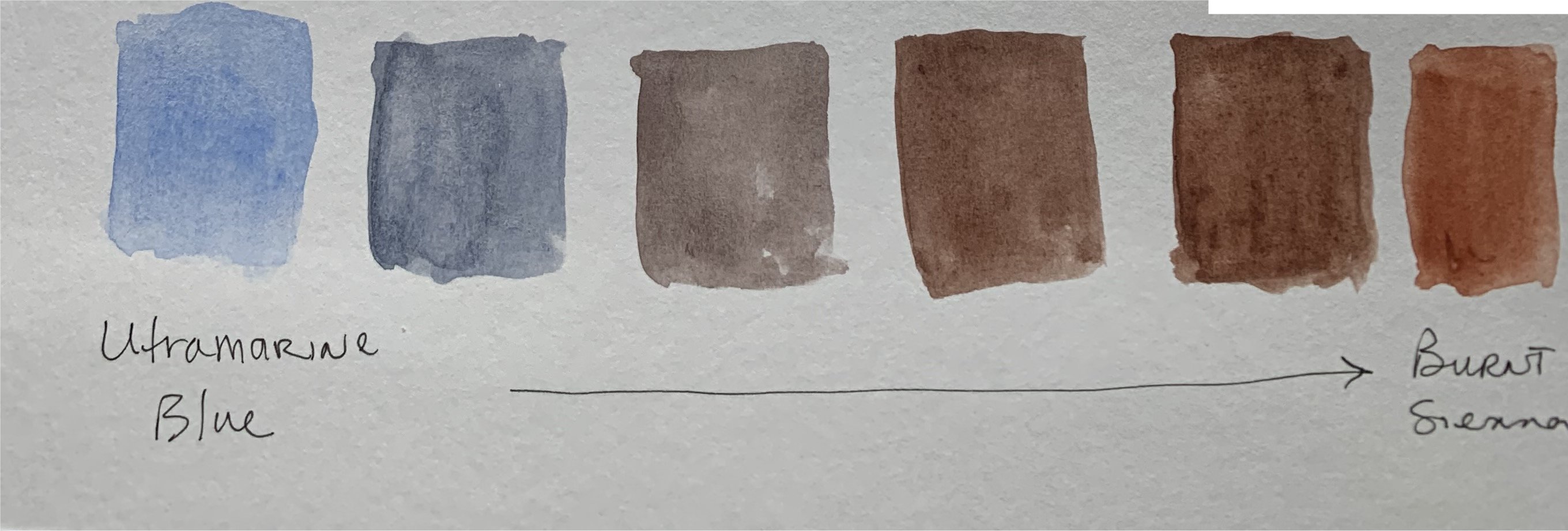 Ultramarine and Burnt Sienna color range
The semi-transparency of these two colors allows you to build darker areas via layering the paint (a process called glazing). If both colors were transparent, it would be harder to get some rich darks because as I mentioned, transparent colors just don’t block light well.
Layering Color: Best Choices
However, sometimes Burnt Sienna and Ultramarine don’t give me the right shade of brown or gray that I want to achieve. So lately, I’ve been experimenting with different combinations to see what new brown shades I can make. Here are a few examples I made of some various orange and blue combinations of colors I have in my paint box. Note that the Daniel Smith colors used below have transparent watercolor ratings.
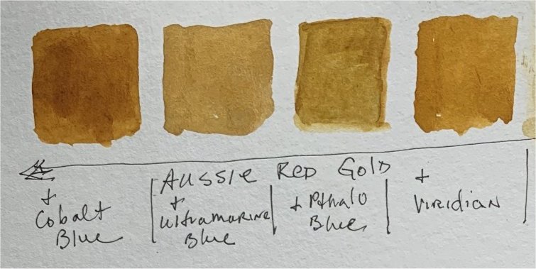 Aussie Red Gold and various blue additions
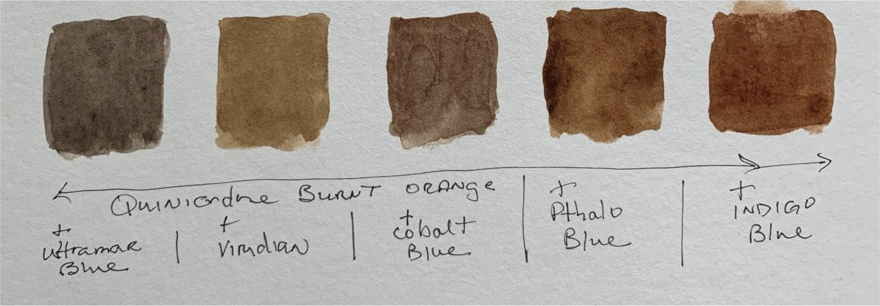 Quinacridone Burnt Orange and various blue additions
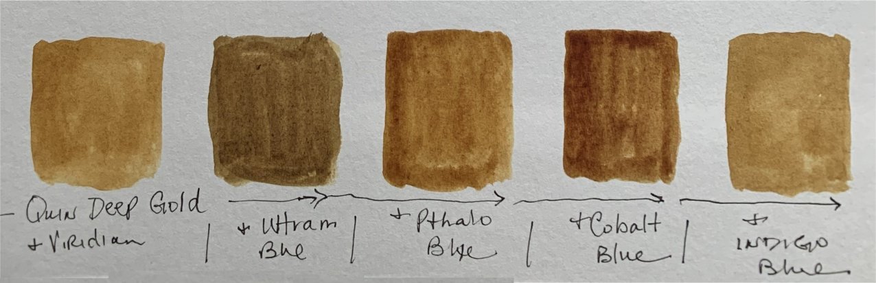 Quinacridone Deep Gold and various blue additions
There are some nice shades there that I think would work great as a final glazing coat. However, I now realize they won’t work for underpainting or as underlying color choices.
Why is that, you may ask?
When semi-transparent paints such as Burnt Sienna and Ultramarine Blue are used, the dry paint on the paper tends to stay in place even when new layers of wet color are applied over the previous dry wash.
In contrast, some transparent watercolor paint tend to get disturbed or move when a new wet layer is applied over them.
This is not what you want when you’ve gone through the trouble of laying down a bunch of fur markings or precise lines in the previous paint layer.
An artist named Caroline Buchanan talked about this in this article, and when I read it, I started to understand that some of the transparent watercolor browns I had been using would only have limited capabilities. I was glad to see that she says the quinacridone colors don't exhibit the movement issue.
I’ve also purchased a color called goethite from Daniel Smith. It’s a semi-transparent orangey color. Once it arrives, I’ll see if I can come up with other combinations with ultramarine blue. I’m also eyeing a semi-transparent color called Lunar blue which I might buy to substitute for ultramarine.
I hope sharing this information about transparent watercolor issues helps you become a better painter. Here are the chart links for Daniel Smith and Winsor Newton to help you decide which paints will work for your goals.
If you have any questions, send me a message from my contact page. I'll do my best to answer them.
